library(tidyverse)
ggplot(penguins,
aes(x = bill_len, y = body_mass)) +
geom_point() +
labs(x = "Bill length (mm)",
y = "Body mass (g)") +
theme_minimal()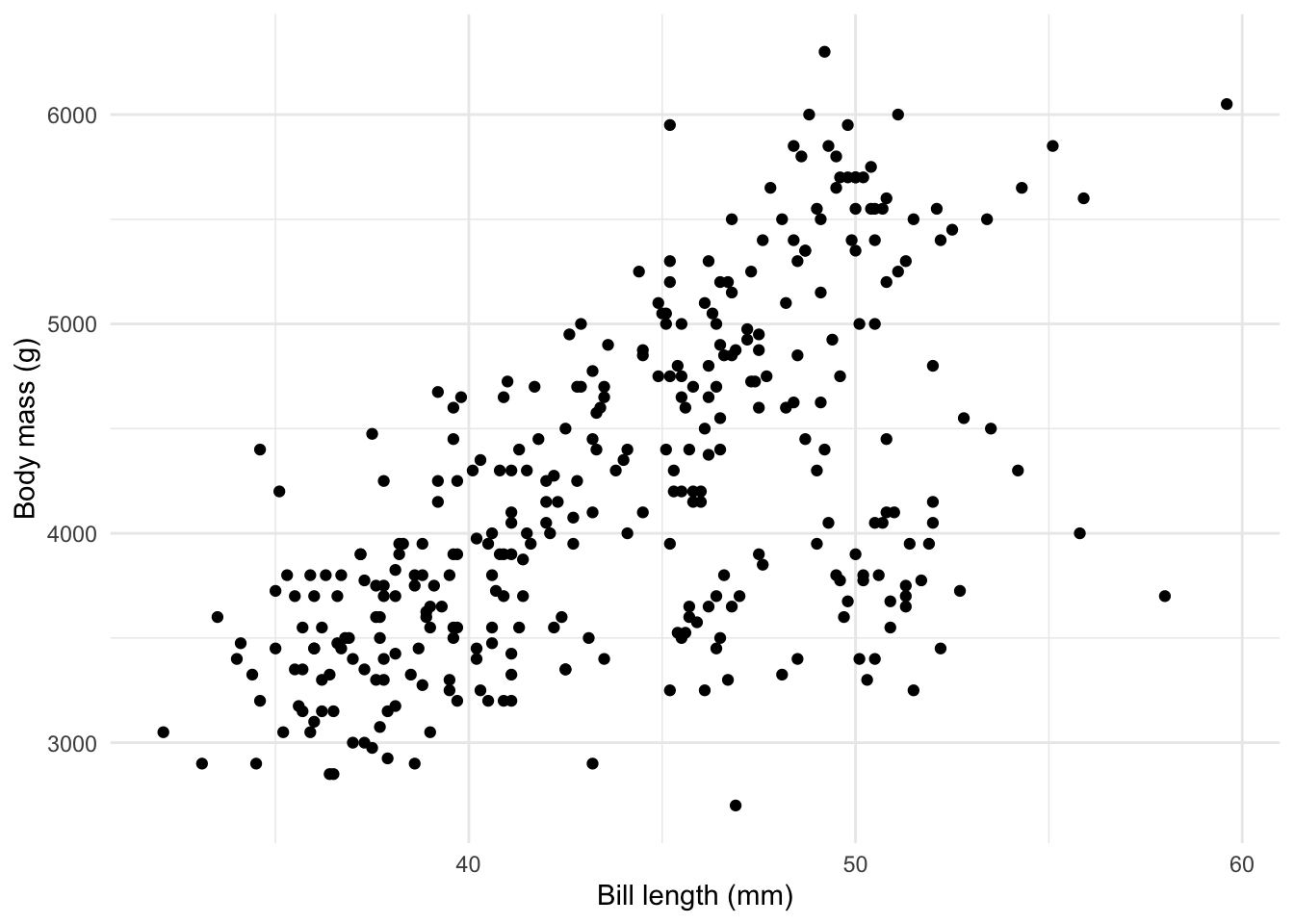
The world of data visualization has been revolutionized in recent years with the introduction of the grammar of graphics and its implementation in R, the ggplot2 package. While other plotting systems set aside a different function for each sort of visualization (histogram, scatterplot, and so on), the grammar of graphics takes the view that the most fundamental characteristics of a plot are the variables it includes and the roles they play (x-axis, y-axis, color, etc). The specific brand of plot is secondary and can be specified later.
To create a visualization, we need to specify three things:
what data is being used.
how the variables are mapped onto the plot (in this case, onto the x- and y-axes).
which geometry should be used to represent the data (scatter plot, line graph, or something else entirely).
Design considerations like axis labels, color palette, and font, can be specified separately after the fact
Notice how all of these elements appear, in order, in the following code chunk.
library(tidyverse)
ggplot(penguins,
aes(x = bill_len, y = body_mass)) +
geom_point() +
labs(x = "Bill length (mm)",
y = "Body mass (g)") +
theme_minimal()